I Class of 2025
A showcase of some projects from the class of 2024-25.
Again, there were too many students to show all projects, so here are a few highlights. Many creative, fun, interesting, challenging visualisation projects were produced but aren’t shown here, but these few give a flavour of what student’s got up to:
Kim was inspired by his commute to visualise seasonal patterns in British rail cancellations. (Repo):

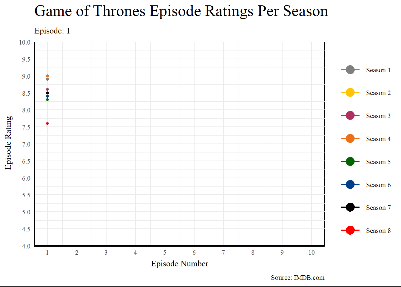
Emma used animation to make her graph of the [Game of Thrones season] ratings(https://emwalker01.github.io/GoT_Ratings/) something of a visual gag. See if you can spot the odd season out. (repo)
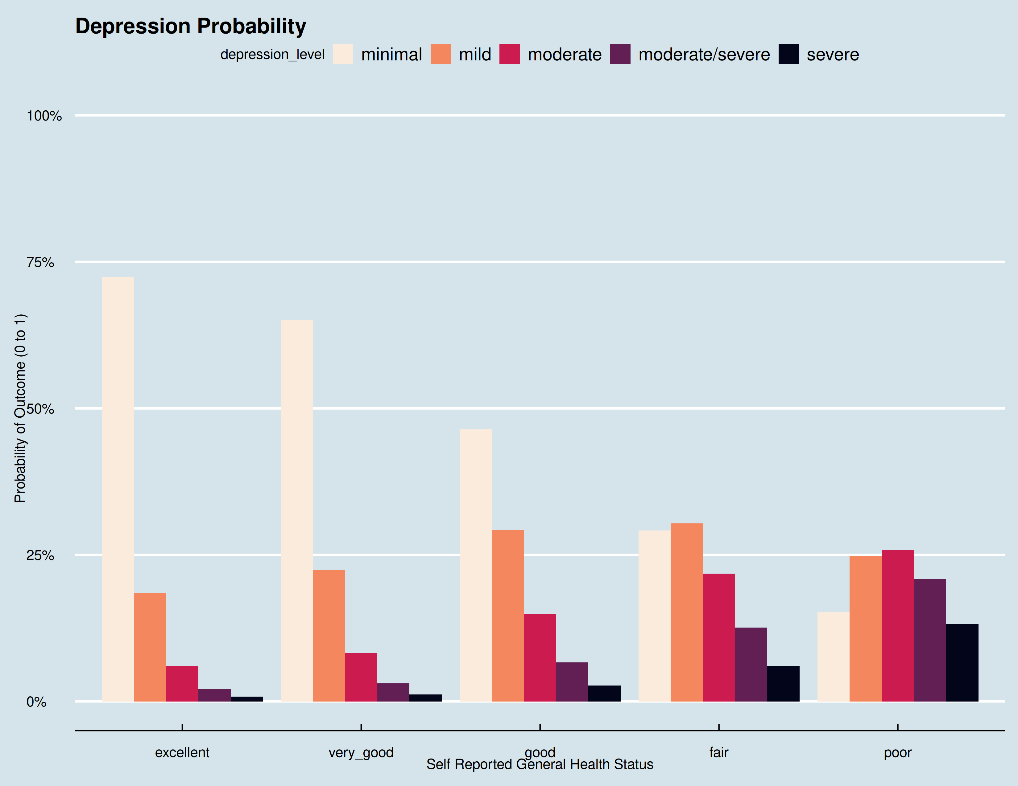
Shawn’s used data from the US (CDC) to ask “To what extend do different medical statuses, including availability and visitations, affect depression with respect to perceived physical wellbeing?” visualisation was (Repo)
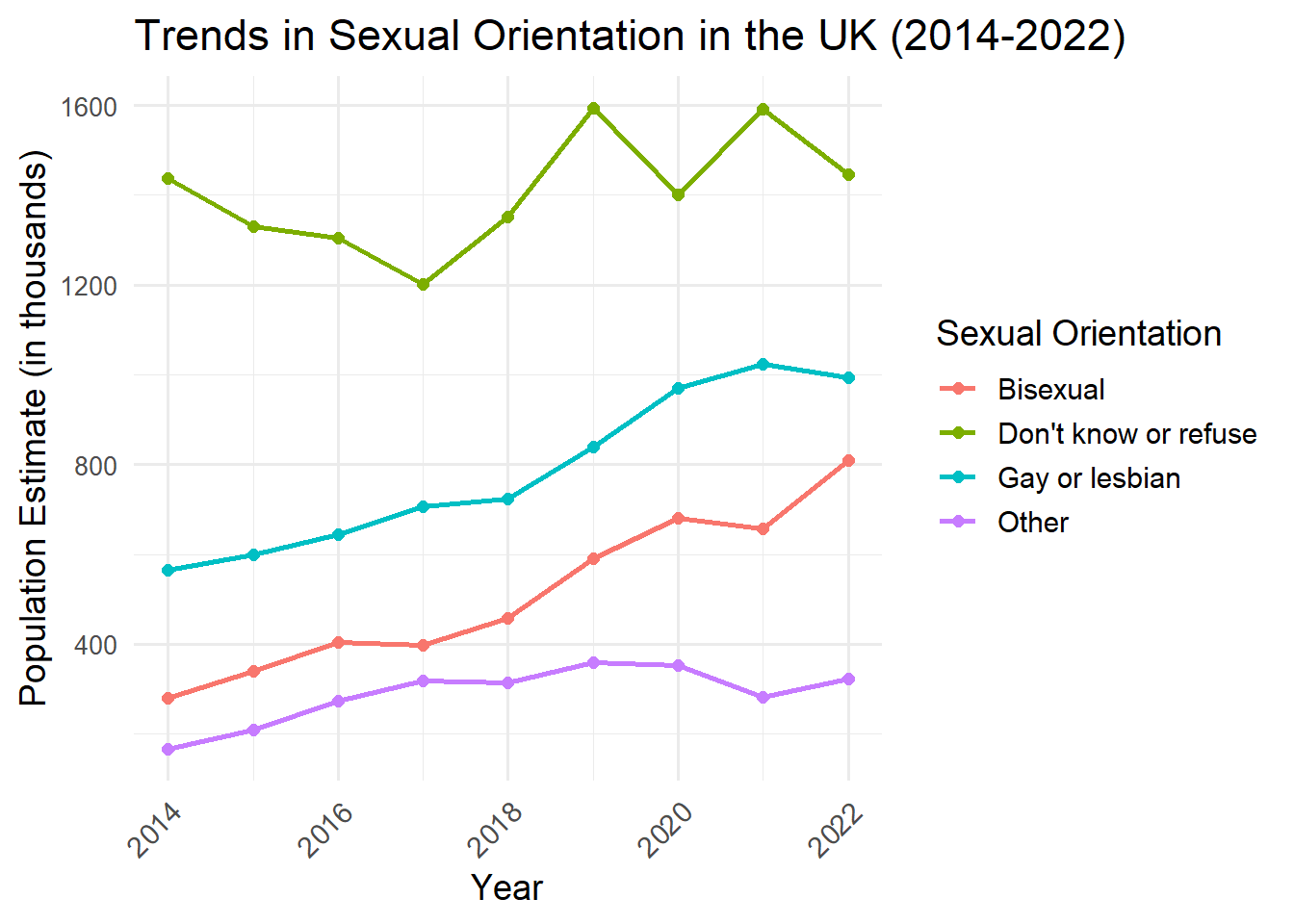
Izzie’s project was Visualising Queer Sexualities in the UK Population 2014-2022 (Repo)
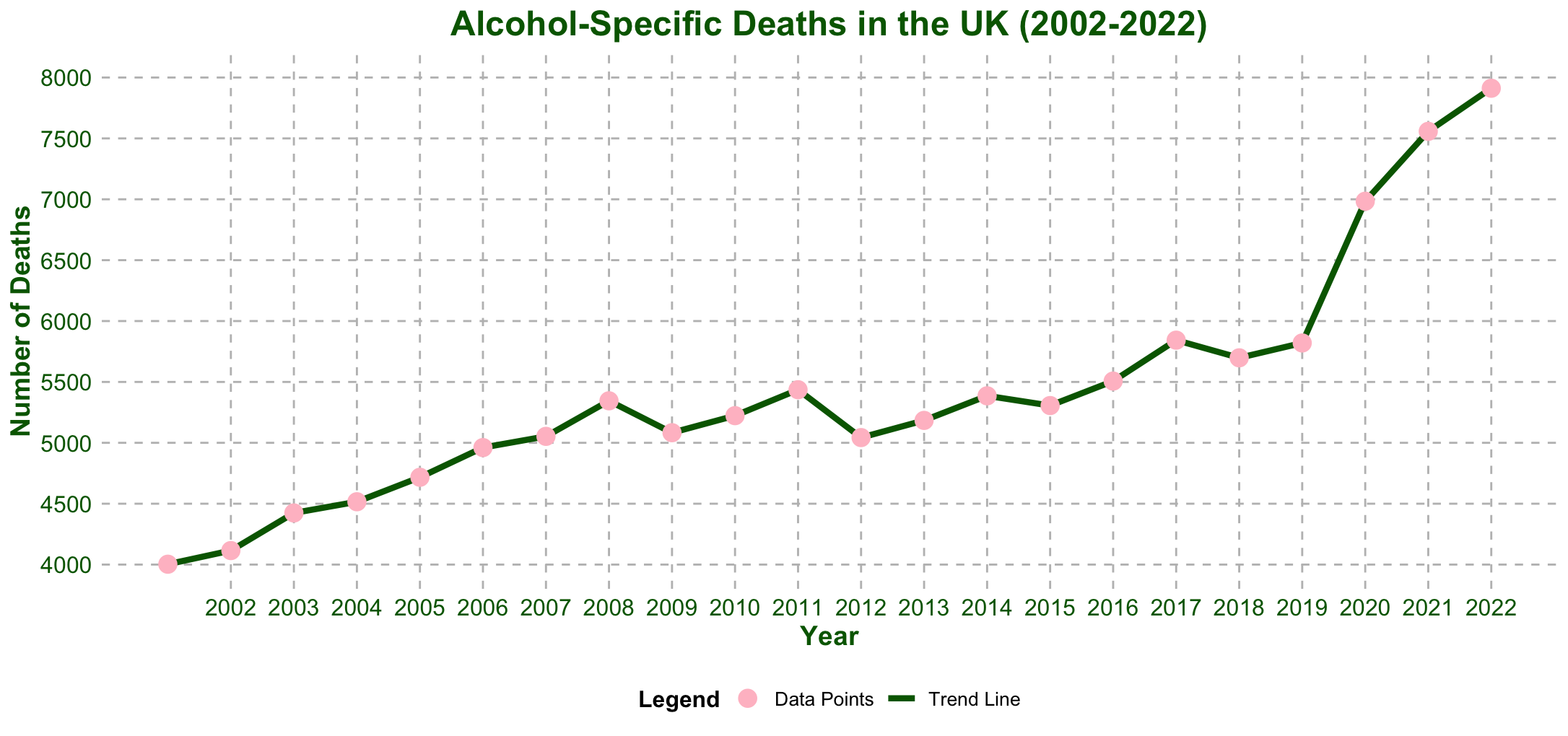
Sophie’s project visualising ONS data on Analysis of Alcohol-Specific Deaths in England (Repo) is sobering:
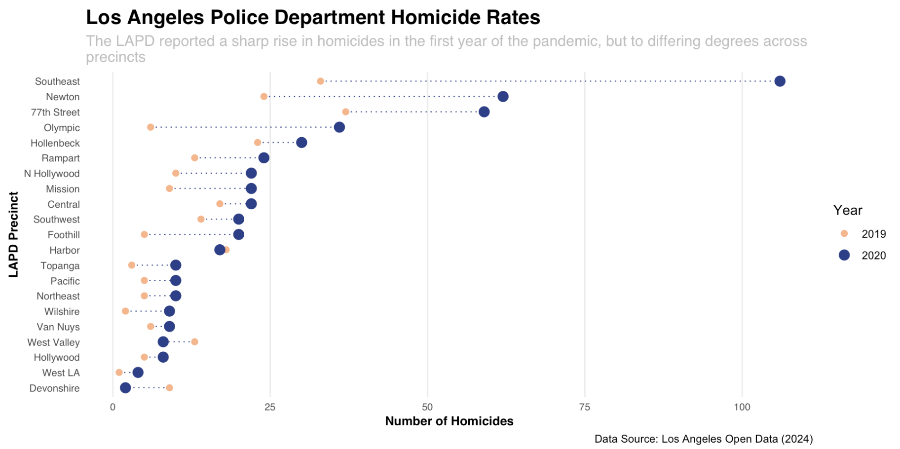
Paulo visualised Homicide Trends in Los Angeles Police Department Precincts (Repo)